
TL;DR:
- Community organizations should use targeted landing pages focused on one specific goal to improve engagement and conversion rates. Effective design involves clear structure, minimal navigation, concise forms, authentic social proof, and mobile responsiveness, avoiding common pitfalls like multiple CTAs and slow load times. Continuous A/B testing and tailoring content to community needs help optimize these pages for better online impact.
Many community-based organisations invest heavily in building a polished homepage, then wonder why online sign-ups, donations, and event registrations remain low. The answer often lies not in the homepage itself, but in the absence of dedicated landing pages built for specific goals. A landing page focuses on one action, such as collecting donations or registering volunteers, using a clear structure of hero section, benefits, social proof, and a call to action. This article covers why that distinction matters, what effective design looks like in practice, and how community organisations can use these pages to drive measurable engagement.
Table of Contents
- Why landing pages drive engagement for community organisations
- Key components of effective landing page design
- Common mistakes: what reduces your landing page conversions
- Testing and optimisation: how community organisations can achieve better results
- What most guides miss about landing page design for Australian community organisations
- Ready to transform your organisation’s online impact?
- Frequently asked questions
Key Takeaways
| Point | Details |
|---|---|
| Landing pages outperform homepages | Dedicated landing pages drive focused engagement and increase conversion rates compared to generic homepages. |
| Keep structure simple | A clear headline, benefits, proof, and a single strong CTA yield the best results. |
| Short forms boost action | Reducing the number of form fields makes visitors much more likely to complete the desired action. |
| Mobile-first is essential | If your landing page doesn’t perform on mobile, you risk losing over 40% of potential supporters. |
| Test and refine regularly | Continual A/B testing and updates to headlines or CTAs can substantially lift your engagement. |
Why landing pages drive engagement for community organisations
A homepage serves many purposes at once. It introduces your organisation, links to programmes, shares news, and directs visitors to multiple destinations. That breadth is useful for general awareness, but it works against conversion when a specific action is the goal.
A landing page removes all that complexity. It is built around one campaign objective, whether that is encouraging donations during an annual appeal, registering attendees for a community event, or collecting volunteer sign-ups for a new programme. Every element on the page, from the headline to the image to the form, exists to support that single goal.
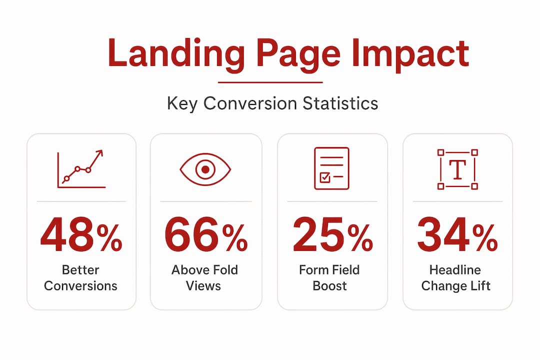
The evidence backs this up. Dedicated landing pages lift conversions by up to 48% compared to generic homepages. That is not a minor improvement. For a community organisation counting every sign-up or dollar donated, a 48% uplift can be the difference between a campaign that meets its target and one that falls short.
Content strategy also matters. The same research notes that 66% of visitor attention sits above the fold, meaning the majority of people will not scroll down the page at all. This makes the opening section of a landing page the most critical real estate your organisation has online. Shock tactics, which are sometimes used by commercial brands, tend to perform poorly for nonprofits and community groups. Impact narratives, which show real stories and measurable outcomes, are far better suited to building the trust that motivates action.
You can see how this plays out in examples of website layouts that have been designed specifically for community impact. The layouts that perform best share a consistent pattern: focused messaging, minimal navigation, and a single clear path forward for the visitor.
Key differences between a homepage and a landing page:
| Feature | Homepage | Landing page |
|---|---|---|
| Number of goals | Multiple | One |
| Navigation links | Full menu | None or minimal |
| Content length | Varies | Focused and purposeful |
| Audience | General visitors | Specific campaign traffic |
| Conversion focus | Low | High |
“Storytelling and impact narratives consistently outperform shock tactics for nonprofits seeking to build lasting donor relationships and community trust.”
Key components of effective landing page design
Once the purpose of a landing page is clear, the next question is what it should actually contain. Effective design is not about visual complexity. It is about structure, clarity, and guiding the visitor towards one action without friction.
Understanding web design terminology helps here. Terms like “hero section,” “CTA” (call to action), “social proof,” and “above the fold” describe specific functional components, each with a defined role in the conversion process.
The standard structure that consistently produces results includes the following components, in order:
- Hero section — A strong headline, a supporting subheadline, and a prominent call to action. This is the first thing visitors see, and it must communicate value immediately.
- Benefits section — A brief explanation of what the visitor gains by taking action. For a community organisation, this might describe how a donation will be used or what volunteers will experience.
- Social proof — Testimonials, impact numbers, partner logos, or media mentions that confirm the organisation is credible and that taking action is worthwhile.
- How it works — A short explanation of the process after the visitor acts. This removes uncertainty and reduces hesitation.
- Final CTA — A repeated or reinforced call to action at the bottom of the page, capturing visitors who scrolled past the first prompt.
Form design is one of the most overlooked components. Research consistently shows that 3 form fields convert 25% better than forms with 9 fields. For most community organisations, the instinct is to collect as much information as possible upfront. That approach costs completions. Ask only for what is essential at the point of conversion and gather additional information later through follow-up communications.
Mobile-first design is also non-negotiable. More than half of all web traffic in Australia arrives via mobile devices. A landing page that loads slowly or requires users to pinch and zoom on a small screen will lose visitors before they have read your headline.
Pro Tip: Remove all navigation links from your landing page. When a visitor has a full menu available, they will often click away to explore your site rather than complete the intended action. A focused, distraction-free page keeps attention where it belongs.
The table below summarises the design components and their function:
| Component | Function | Common mistake |
|---|---|---|
| Hero headline | Communicate value instantly | Vague or organisation-centric language |
| CTA button | Drive the primary action | Weak text like “Submit” or “Click here” |
| Form fields | Collect essential data | Too many fields, high friction |
| Social proof | Build trust and credibility | Missing or placed too far down the page |
| Mobile layout | Serve mobile visitors correctly | Not tested on actual devices |
For organisations wanting to go deeper on the design principles behind high-performing pages, the work covered in web design for social impact provides a strong framework grounded in both ethics and effectiveness.
Common mistakes: what reduces your landing page conversions
Even well-intentioned landing pages can underperform when common errors go unaddressed. Understanding what goes wrong is as important as knowing what to build correctly.
The most frequent mistakes observed across nonprofit and community organisation campaigns include:
- Mismatched traffic — Sending paid social media traffic to a page built for email subscribers, or vice versa, creates a disconnect between the visitor’s expectation and what they find. Conversion rates drop sharply when the messaging on the page does not align with the source that brought the visitor there.
- Multiple calls to action — Asking visitors to donate, sign up for a newsletter, share on social media, and register for an event all on the same page reduces the likelihood of completing any of them. Multiple CTAs confuse users and measurably reduce conversion rates.
- Long or complex forms — As noted earlier, form length is a direct predictor of completion rate. Long forms signal effort and cost the visitor time they may not want to spend.
- Poor mobile experience — Poor mobile design causes 40% or more of visitors to bounce immediately. With Australian mobile usage rates as high as they are, this is not a minor issue.
- Slow load times — Every additional second of load time increases bounce rates. This is particularly relevant for community organisations whose sites may run on older infrastructure or shared hosting plans.
The relationship between friction and conversion is well documented. Reducing friction for giving is one of the most effective strategies available to nonprofits. Friction is anything that adds effort or uncertainty to the process of completing an action. Long forms, confusing layouts, poor mobile experiences, and slow pages all add friction.
Making a landing page SEO-friendly also contributes to reducing friction by ensuring that organic search visitors land on pages that match their intent. An SEO audit for nonprofits can identify whether your current pages are attracting relevant traffic or sending the wrong visitors to the wrong destinations.

Pro Tip: Do not measure success by conversion rate alone. Track scroll depth (how far down the page visitors go) and time on page as well. These metrics reveal whether visitors are engaging with the content before deciding, or leaving without reading anything at all.
Testing and optimisation: how community organisations can achieve better results
Building a landing page is not a one-time event. Organisations that treat it as finished on launch day are leaving conversions on the table. Systematic testing is what separates pages that improve over time from those that plateau.
A/B testing, also called split testing, means showing two versions of a page to different visitors and measuring which version produces better results. It does not require technical expertise or large budgets. Most email marketing platforms and website builders include basic A/B testing tools.
The process for applying A/B testing to a landing page follows this sequence:
- Audit the current page — Identify which metrics are underperforming: low conversion rate, high bounce rate, or poor scroll depth.
- Form a hypothesis — Decide what change you believe will improve performance and why. For example: “Changing the headline from organisation-centric to benefit-centric will increase sign-ups.”
- Test one variable at a time — Change only one element per test so the results are attributable to that specific change.
- Run the test long enough — Allow enough traffic to reach statistical significance before drawing conclusions. A weekend is rarely sufficient.
- Record and apply findings — Document what was tested, what changed, and what the result was. Apply winning changes and move to the next test.
Research shows that headline changes produce a 34% lift in conversions, CTA placement produces a 21% lift, and each field removed from a form produces an 18% improvement. These are meaningful gains achievable through systematic testing without redesigning the entire page.
For community organisations running Google Ad Grants, testing is especially important. The grant provides up to $10,000 USD per month in free Google Ads spend, and landing page quality directly affects how well those campaigns perform. Learning how to leverage Google Ad Grant funding alongside tested, optimised landing pages gives community organisations a strong advantage.
Pro Tip: Start with the simplest possible test. Change the headline on your most important landing page and measure conversion rate over four weeks. If results improve, make it permanent and move on to testing the CTA button text. Methodical testing compounds over time.
Social proof and trust: essential elements for nonprofit landing pages
Page mechanics alone do not drive action. Visitors to a nonprofit or community organisation landing page need to feel confident that their contribution matters and that the organisation is credible. Social proof provides that reassurance.
Social proof takes several forms on a landing page:
- Testimonials — Short quotes from past donors, volunteers, or programme participants that speak to the value of getting involved.
- Impact numbers — Specific statistics that show what the organisation has achieved. “We have supported 1,200 families in Western Sydney since 2018” is more persuasive than a general claim about community impact.
- Partner and funder logos — Logos from government bodies, foundations, or well-known corporate partners signal that the organisation is reputable and supported by credible third parties.
- Media mentions — Coverage from local newspapers, radio stations, or industry publications adds external validation.
- Donor or member counts — Showing how many people have already taken the same action reduces the perceived risk for new visitors.
Social proof is essential for nonprofits seeking to build donor trust online. Without it, a visitor has no way to verify that your organisation is effective or that their action will lead to a real outcome. Including navigation links that pull visitors away from the page before they convert is also flagged as a key conversion-killer. Keep the focus tight.
“Trust signals on a nonprofit landing page reduce donor hesitation at the moment of decision. A testimonial placed near the donation form addresses the final objection before the visitor clicks.”
What most guides miss about landing page design for Australian community organisations
Most published guides to landing page design are written with commercial brands in mind. They focus on e-commerce, lead generation for sales teams, or software subscriptions. The principles overlap, but the application differs significantly for Australian community organisations working in local contexts with limited budgets.
The most common error observed is importing a commercial or overseas template and filling in the blanks. A landing page designed to sell an online course looks very different from one designed to recruit volunteers for a neighbourhood food programme. The visual language, the tone, the pace of the content, and the trust signals required are all different.
Meaningful web design for community impact requires genuine understanding of the audience. A community in regional Queensland has different expectations and reference points than a social enterprise serving migrants in Melbourne. Generic stock photography, borrowed American idioms, and corporate design systems create distance rather than connection.
Mission-driven copywriting is often the most neglected element. Organisations spend significant time on visual design and then write the headline and button text as an afterthought. The copy is what communicates value. It should reflect the community’s own language, acknowledge the real problem being addressed, and make the benefit of acting specific and concrete.
Ethical web design also plays a role here. Practices that prioritise accessibility, honest representation, and sustainable page performance are not at odds with high conversion rates. In fact, they tend to support better engagement over time because they build genuine trust rather than manufacturing urgency through manipulative design patterns.
The single most effective approach for community organisations is simplicity. One page. One goal. Clear language. Authentic visuals from within the community. This is not a limitation; it is a strategic advantage that larger commercial organisations rarely execute well.
Ready to transform your organisation’s online impact?
Effective landing page design is one of the highest-return investments a community organisation can make in its online presence. The evidence is clear: focused pages, clean structure, minimal friction, and authentic social proof drive measurably better results than general-purpose homepages.
At Marzipan, we work with mission-led organisations across Australia to build and optimise digital experiences that align with your values and deliver real outcomes. Our approach combines sustainable web design with performance-driven strategy, so your pages look credible, load fast, and convert effectively. If your organisation is ready to move beyond a homepage that does everything and nothing at once, our digital marketing services can help you build a focused online presence that grows community engagement over time. Reach out to start a conversation about what your next campaign landing page could achieve.
Frequently asked questions
What is the most important element on a landing page?
The headline and main CTA are the most critical elements because they drive initial attention and direct the visitor’s next action. Prioritising these two elements produces the largest measurable conversion lifts.
How many CTAs should a landing page have?
A landing page should have one primary CTA. Multiple CTAs reduce conversion rates by creating confusion about what the visitor is supposed to do next.
Why should nonprofit forms be short on landing pages?
Short forms are completed more often because they require less effort from the visitor. Reducing fields from nine to three increases conversion rates by 25%.
What happens if a landing page is not mobile-friendly?
Visitors who encounter a poorly optimised mobile page are likely to leave immediately. Poor mobile design leads to bounce rates of 40% or more, which significantly reduces the total number of conversions.
How often should landing pages be tested and updated?
Landing pages should be tested continuously, with changes made based on data rather than assumption. Iterative testing of headlines, CTAs, and forms produces compounding improvements in conversion performance over time.


