
TL;DR:
- Many Australian community organizations miss supporter engagement when their websites are not mobile-friendly and difficult to navigate. Implementing a layered, mobile-first responsive design using free tools and intrinsic layout techniques enhances user experience, search rankings, and operational efficiency. Early planning for accessibility and future adaptability ensures sustainable growth and performance across diverse devices and user needs.
Many Australian community organisations lose potential supporters the moment those visitors arrive on a mobile device and find a site that is difficult to read or navigate. When a page requires pinching, zooming, or excessive scrolling just to find a donation button or event listing, most users leave immediately. Responsive design captures 67% more mobile conversions compared to non-responsive alternatives, which means every community group without a properly responsive site is actively missing engagement. This guide sets out a practical, step-by-step framework for implementing responsive web design, covering the tools you need, the key techniques to apply, how to test your results, and what measurable improvements to expect.
Table of Contents
- What you need before you start: tools and prerequisites
- Step-by-step: how to make your website truly responsive
- Testing, accessibility and performance: verifying your responsive design
- Real-world results: what responsive design delivers for your organisation
- Rethinking responsive web design: futureproofing for Australian communities
- Take the next step: expert support for your responsive web journey
- Frequently asked questions
Key Takeaways
| Point | Details |
|---|---|
| Start mobile-first | Designing for smaller screens first ensures your site delivers well everywhere. |
| Use fluid grids | Relative units and flexible layouts adapt content for all devices without breaking. |
| Optimise for real users | Test performance, accessibility, and usability on actual devices to achieve true engagement. |
| Component-level responsiveness | Go beyond media queries by using container queries and scalable type for futureproof sites. |
| Responsive design lifts results | Australian community organisations see improved engagement, SEO, and reduced support burden with responsive best practices. |
What you need before you start: tools and prerequisites
Now that you understand the stakes, let us make sure you are set up for success with the right resources.
Before writing a single line of CSS, community organisations need a clear picture of what responsive web design actually requires. The good news is that the core tools are free and the foundational knowledge is accessible to anyone with basic HTML and CSS familiarity. You do not need a full-time developer. Many small organisations have a staff member or volunteer who can handle implementation with the right guidance.
Core skills and team requirements
The minimum skill level required is a working understanding of HTML structure and CSS selectors. Familiarity with browser developer tools is also essential, as these allow you to simulate different screen sizes without needing to own every device. If no one on your team has these skills, a short online course covering HTML and CSS fundamentals is a practical starting point before attempting responsive implementation.
Essential tools at a glance
| Tool | Purpose | Cost |
|---|---|---|
| Browser developer tools (Chrome, Firefox) | Simulate breakpoints and inspect CSS | Free |
| MDN responsive design guide | Reference documentation and tutorials | Free |
| Flexbox Froggy / Grid Garden | Interactive CSS layout playgrounds | Free |
| Squoosh or ImageOptim | Image compression for performance | Free |
| Google Lighthouse | Performance and accessibility auditing | Free |
Using these tools together covers the full cycle of build, test, and audit without any software cost. This is particularly relevant for Australian community organisations working within tight budgets.
Assets to prepare before you build
Preparing your digital assets in advance saves significant time during implementation. Key assets to gather and format correctly include:
- Logos in SVG format, which scale without quality loss at any screen size
- Images sized at multiple resolutions and saved as WebP where possible for smaller file sizes
- Fonts hosted via Google Fonts or served locally, with fallback font stacks defined in CSS
- Colour palette documented in CSS custom properties (variables) for consistent theming across breakpoints
- Content hierarchy mapped out, so you know which elements must appear above the fold on mobile
For community organisations specifically, responsive design enhances engagement across the more than 58% of web traffic now arriving from mobile devices, and it directly supports Core Web Vitals improvements that Google uses to rank sites in search results. Starting with well-prepared assets makes every subsequent step faster and more reliable.
Pro Tip: Open-source CSS frameworks such as Pico CSS or Skeleton provide a lightweight responsive baseline, which is useful for organisations that want a solid starting structure without writing everything from scratch.
Step-by-step: how to make your website truly responsive
With your toolkit ready, let us move into the heart of making your site work for every device.
Responsive web design is not a single technique. It is a layered set of practices applied in a specific sequence. Skipping steps or applying them out of order leads to inconsistent results across devices. Follow the steps below in order for the most reliable outcome.
Step 1: Start with mobile-first CSS
The mobile-first approach means writing your base styles for the smallest screen first, then using "min-width` media queries to progressively add styles for larger screens. This approach is more efficient than starting with a desktop layout and trying to shrink it down, because it forces you to prioritise only the content that matters most. On a small screen, every element earns its place.
Step 2: Build with fluid grids
Fluid grids use relative units such as percentages, fr, em, and rem rather than fixed pixel values. CSS Grid and Flexbox are both inherently responsive when configured correctly. A grid column set to 1fr will always fill an equal share of the available space, regardless of screen width. Avoid setting widths in pixels for any layout container.

Step 3: Apply media queries at logical breakpoints
Common breakpoint values such as 360px, 768px, and 1200px provide a reliable starting structure, but the more important principle is to add a breakpoint wherever your layout breaks, not at every device width you can think of. Open your browser dev tools, resize the viewport slowly, and add a media query only when the layout actually looks wrong. This keeps your CSS lean and easier to maintain.
Step 4: Optimise images and video
Images are the single largest contributor to slow mobile load times. Use the srcset attribute to serve different image sizes depending on screen resolution. Use the <picture> element when you need art direction, for example showing a cropped close-up on mobile and a wider shot on desktop. Always set max-width: 100% on images so they never overflow their container.
Step 5: Use fluid typography with clamp
Fluid typography with the CSS clamp() function scales font sizes smoothly between a minimum and maximum value based on viewport width. For example, font-size: clamp(1rem, 4vw, 2rem) sets a floor of 1rem, a ceiling of 2rem, and allows fluid scaling between them. This removes the need for separate font-size declarations at every breakpoint.
Step 6: Add component-level responsiveness with container queries
Container queries are a newer CSS feature that allow a component to respond to the size of its parent container rather than the viewport. This is particularly useful for reusable components such as event cards or donation widgets that appear in different layout contexts across a site. Container queries give each component its own responsive logic, independent of where it is placed.
Summary of steps
| Step | Purpose | Key technique |
|---|---|---|
| Mobile-first CSS | Prioritise small screen content | min-width media queries |
| Fluid grids | Flexible layout without pixel widths | fr, %, Flexbox, Grid |
| Media queries | Adjust layout at content breakpoints | @media (min-width: ...) |
| Image optimisation | Reduce load time, improve LCP | srcset, <picture>, WebP |
| Fluid typography | Smooth font scaling | clamp() |
| Container queries | Component-level responsiveness | @container |
“Intrinsic design and component-level strategies represent the future of CSS layout. Building with these tools from the start means less rework and more durable results as the device landscape continues to change.” Adapted from current CSS architecture thinking.
Pro Tip: Layer your responsive logic intentionally. Use media queries for overall page structure, container queries for individual components, and clamp() for typography. This layered approach, outlined in sustainable web design principles, reduces the total number of overrides needed and makes your CSS much easier to audit later. You can also connect this approach to your SEO audit process by verifying Core Web Vitals scores improve after each responsive change.
For organisations serving linguistically diverse communities, localisation best practices should be considered alongside layout decisions, as text expansion in different languages can affect responsive layouts significantly.
Testing, accessibility and performance: verifying your responsive design
After building out, it is vital to confirm real users get the experience you designed across all devices and abilities.
Device and browser testing checklist
Testing on real devices is the most reliable method, but browser dev tools cover most scenarios well. At minimum, test at the following breakpoints and device types:
- Mobile portrait: 360px to 414px width
- Mobile landscape: 568px to 812px width
- Tablet portrait: 768px width
- Tablet landscape: 1024px width
- Desktop: 1200px and above
Test in at least two browsers: Chrome and Firefox. Safari on iOS behaves differently in some CSS implementations, so if your audience includes iPhone users (which it almost certainly does), testing on an actual iOS device or using Safari’s developer tools is worthwhile.
Accessibility and touch target requirements
Touch targets such as buttons and links must be at least 48px in height and width. Elements placed too close together cause what testers call “fat finger” errors, where a user taps the wrong element. Spacing between interactive elements should be at least 8px.
Performance checks to complete before launch:
- Lazy loading applied to all below-the-fold images using the
loading="lazy"attribute - Image compression verified using Squoosh or a similar tool, targeting WebP format
- ARIA attributes added to interactive components that are not natively accessible
- Colour contrast verified against WCAG 2.1 AA standards using a free contrast checker
- Form labels confirmed as programmatically associated with their inputs
Warning: Non-composited animations affect 40% of mobile pages and cause layout instability. Unoptimised images account for 50 to 70% of total page weight in many cases, and missing dimensions on image or video elements are a leading cause of cumulative layout shift (CLS) failures. These are the edge cases most likely to break your layout or hurt your Google rankings.
Pro Tip: Use A/B testing approaches to compare layout variations on real traffic, particularly for high-value pages such as donation forms or volunteer sign-up pages. Even a simple two-variant test can reveal whether a responsive layout change improves completion rates. This connects directly to mobile SEO performance goals for Australian organisations.
Real-world results: what responsive design delivers for your organisation
Completing these steps brings tangible improvements. Here is what community organisations can expect based on current data.
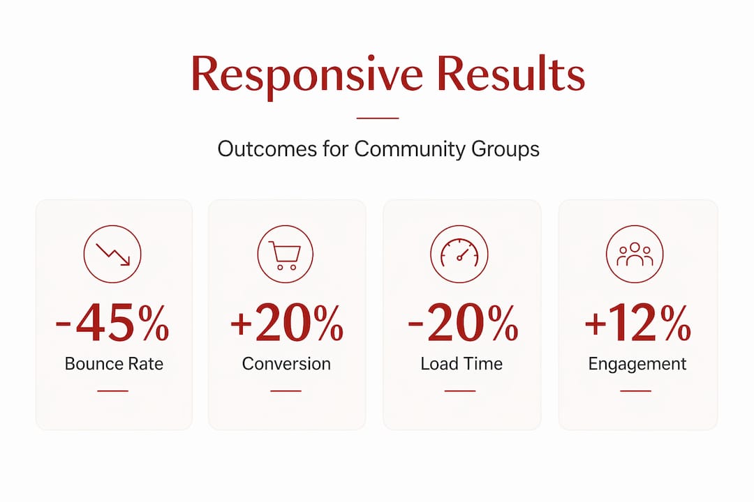
Before and after: key performance indicators
| Metric | Before responsive design | After responsive design |
|---|---|---|
| Mobile bounce rate | 65 to 80% | 35 to 50% |
| Mobile conversion rate | Low baseline | 15 to 20% increase |
| Average page load time (mobile) | Slow (4 to 6 seconds) | Reduced by up to 20% |
| Mobile conversions captured | Baseline | Up to 67% more |
| Content update time (staff) | Multiple templates | Single codebase |
Responsive design boosts conversion rates 15 to 20% and reduces mobile load times by approximately 20%, which directly supports both user engagement and Google search rankings. For community organisations, conversions include donations, event registrations, volunteer sign-ups, and newsletter subscriptions. Each of these outcomes is measurable and attributable to design changes.
Additional organisational benefits
Beyond the headline performance numbers, responsive design produces operational savings. Staff and volunteers managing website content benefit from a single codebase, meaning content only needs to be updated once rather than separately for desktop and mobile versions. This reduces the risk of outdated information appearing on one version of the site and cuts the time spent on content maintenance.
AI tools for improving SEO visibility can complement a responsive rebuild by identifying keyword gaps and content opportunities, particularly for organisations targeting local search terms in Sydney and surrounding areas. A responsive foundation makes it far easier to implement structured data, page speed improvements, and accessibility enhancements that search engines reward.
Rethinking responsive web design: futureproofing for Australian communities
The common approach to responsive web design still focuses on chasing device sizes. Designers pick a list of popular screen widths and write media queries to match each one. This method worked reasonably well when mobile, tablet, and desktop covered the full range of devices. It is no longer sufficient.
Foldable phones, large-screen tablets, and unconventional browser sizes mean that a fixed list of breakpoints will always leave gaps. More importantly, it creates technical debt. Every time a new popular screen size emerges, someone has to update the stylesheet. For small teams with limited resources, this is unsustainable.
Intrinsic design using CSS Grid auto-fit/minmax and container queries reduces reliance on media queries by letting the browser make layout decisions based on available space. A grid column defined with minmax(250px, 1fr) will automatically wrap when the container is too narrow, without any media query needed. This is a more durable approach because the layout adapts to context rather than matching a predetermined list of device widths.
The layered strategy described in this guide, using media queries for page structure, container queries for components, and clamp() for typography, is not just a technical preference. It is a practical choice for organisations that cannot afford frequent redesigns. Building this way from the start means the site remains functional and maintainable as the web continues to change.
Accessibility is the other area where early decisions matter most. Treating accessibility as an afterthought results in costly retrofits. Community organisations in Australia serve diverse populations that may include people with disabilities, older users, or those using assistive technology. Building with ARIA attributes, sufficient colour contrast, and keyboard navigability from the outset is far more efficient than correcting these issues after launch. This also aligns with sustainable SEO practice by ensuring the site meets the technical standards that search engines increasingly use to assess quality.
For small teams working with limited budgets, the key message is this: a layered, intrinsic approach does not require more resources than a conventional breakpoint-based approach. It requires different thinking at the start of the project. The upfront effort pays back over time through reduced maintenance, fewer layout failures, and a site that continues to perform as device diversity increases.
Take the next step: expert support for your responsive web journey
Building a responsive site using the steps above is achievable for many community organisations, particularly those with some technical capacity. But the gap between a functional responsive site and one that consistently converts supporters, ranks well in local search, and stays performant as your content grows is often where expert support adds the most value.
At Marzipan, we specialise in web design for community-based organisations, combining ethical AI tools, sustainable development practices, and performance-driven SEO into sites built to last. We apply every principle covered in this guide, from mobile-first CSS and intrinsic layout techniques to Core Web Vitals optimisation and accessibility compliance, tailored specifically to the needs of Australian nonprofits, community groups, and mission-led organisations. If your site is not performing the way it should on mobile, or if you want to rebuild on a foundation that scales with your impact, we can help you take that next step.
Frequently asked questions
What are the main differences between responsive and adaptive web design?
Responsive design uses fluid layouts that adjust to any screen size using a single codebase, while adaptive design serves fixed layouts built for specific screen widths. Responsive design ranks 11% faster and is generally preferred for SEO and long-term site maintenance.
How do I choose the best breakpoints for my website?
Select breakpoints based on where your layout or content actually breaks visually, not based on specific device names. Common starting values are 360px, 768px, and 1200px, but your content may require different points.
Which tools can help me test if my site is truly responsive?
Browser developer tools in Chrome or Firefox allow you to simulate any viewport width for free. Real device testing across mobiles, tablets, and desktops remains the most reliable verification method, supplemented by Google Lighthouse for performance and accessibility audits.
What common issues break a responsive layout?
Unoptimised images, fixed pixel widths, and missing dimensions on image and video elements are the most frequent causes of layout breakage, slow load times, and cumulative layout shift failures across screen sizes.
How does responsive web design impact my organisation’s SEO?
A responsive site improves Core Web Vitals scores, reduces bounce rates from mobile visitors, and meets Google’s mobile-first indexing requirements. For Australian community organisations, mobile engagement above 58% of traffic makes responsive design directly connected to search visibility and organic reach.


